This page consists of four short sections which we hope will help you "read" the images in the Atlas. Apart from the last section, most of this material will be pretty obvious to anyone with experience of image processing.
|
|
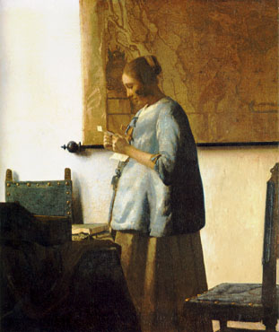
| A map of the light reaching a certain point in the studio of Jan Vermeer, in about 1663. It is believed that the artist used a Camera Obscura to ensure correct perspective in his pictures. |
Now, colour is the eye's way of describing the spectrum of the light; for instance the pale blue of the dress in the picture tells us that the light from this direction contains a range of wavelengths in the visible band, but is relatively strong at around 400 nm. Colour is actually a rather inaccurate measure of the spectrum; for instance it is hard to tell a mixture of red and blue light, i.e. purple, from very deep blue, i.e. violet. For technical work astronomers prefer to obtain a series of "monochrome" images through coloured filters, so that each is a record of light with wavelengths within a narrow band. The astronomical B, V, and R "bands" correspond roughly to the three basic colours, blue, green and red. While it might be cute to print, for instance, an R-band image in deep red colours, it is a lot easier to see fine detail if it is printed in "black and white" grey-scale. Our images are now abstracted a further step: the intensity of the white light from our print (or computer monitor) is telling us about the intensity of the red light on the sky.
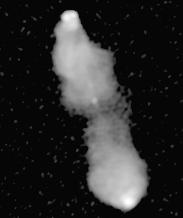
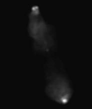 So here is one of the Atlas images displayed as a
Linear grey-scale.
In this display, the brightest point in the image comes out white, and
the darkest black. In between, the grey-scale intensity is linearly
proportional to the intensity of the image, hence the name.
Not very impressive, is it? The problem is that
the image has a high dynamic range, in the sense that
the brightest points are very much brighter than nearly all the rest,
so when the bright points are properly displayed, the fainter parts are
invisible. This is a common problem with astronomical images, which
usually show objects shining by their own light and therefore can have
much greater dynamic ranges than images of scenes on Earth, where everything
is illuminated by the same Sun.
So here is one of the Atlas images displayed as a
Linear grey-scale.
In this display, the brightest point in the image comes out white, and
the darkest black. In between, the grey-scale intensity is linearly
proportional to the intensity of the image, hence the name.
Not very impressive, is it? The problem is that
the image has a high dynamic range, in the sense that
the brightest points are very much brighter than nearly all the rest,
so when the bright points are properly displayed, the fainter parts are
invisible. This is a common problem with astronomical images, which
usually show objects shining by their own light and therefore can have
much greater dynamic ranges than images of scenes on Earth, where everything
is illuminated by the same Sun.
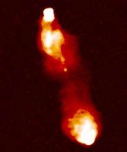
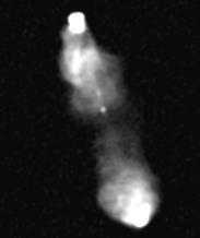 One solution is to burn out the brighter parts.
Here everything brighter than 10% of the peak is rendered white, and the
brightness of everything else is increased by a factor of ten. The fainter
parts are now clearer, but of course we have lost all the detail in the
bright peaks, and in fact there is still some very faint emission which
you probably can't see (depending on how your monitor behaves).
One solution is to burn out the brighter parts.
Here everything brighter than 10% of the peak is rendered white, and the
brightness of everything else is increased by a factor of ten. The fainter
parts are now clearer, but of course we have lost all the detail in the
bright peaks, and in fact there is still some very faint emission which
you probably can't see (depending on how your monitor behaves).
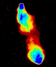
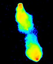
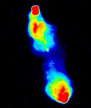 A standard technique to make the faint regions more obvious is to
use pseudo-colour.
This image is burnt out in just the same way as the previous one.
We are now using different colours to represent the different intensities:
remember when looking at these images that the "colours" have nothing
whatsoever to do with the "true" colour or spectrum of the emission in
any sense; it is just a trick to make the faint regions easier to see.
For consistency, we always use the same pseudo-colour palette in this
atlas, but provided a given image intensity is displayed everywhere as
the same colour, we could have chosen any colour scheme we liked:
A standard technique to make the faint regions more obvious is to
use pseudo-colour.
This image is burnt out in just the same way as the previous one.
We are now using different colours to represent the different intensities:
remember when looking at these images that the "colours" have nothing
whatsoever to do with the "true" colour or spectrum of the emission in
any sense; it is just a trick to make the faint regions easier to see.
For consistency, we always use the same pseudo-colour palette in this
atlas, but provided a given image intensity is displayed everywhere as
the same colour, we could have chosen any colour scheme we liked:
| 
| 
|
 For this Atlas, we only wanted to give one display of each object, so
we need a display method which shows both the bright and faint structure
at the same time. A solution is the
Logarithmic grey-scale.
Here the brightest point is rendered white and the darkest black, just
as in the first version above, but in between, the
displayed intensity is proportional to the logarithm of the intensity
in the image, so that there
is the same difference in displayed intensity between 10% and 100% of the
peak as between 1% and 10%. This display shows both the bright and the
faint structure, at the price of suppressing much of the finer detail
(and by definition, gives a very misleading impression of true relative
brightnesses!).
For this Atlas, we only wanted to give one display of each object, so
we need a display method which shows both the bright and faint structure
at the same time. A solution is the
Logarithmic grey-scale.
Here the brightest point is rendered white and the darkest black, just
as in the first version above, but in between, the
displayed intensity is proportional to the logarithm of the intensity
in the image, so that there
is the same difference in displayed intensity between 10% and 100% of the
peak as between 1% and 10%. This display shows both the bright and the
faint structure, at the price of suppressing much of the finer detail
(and by definition, gives a very misleading impression of true relative
brightnesses!).
 Having gone this far, we might as well complete the process by
applying pseudo-colour as well.
OK, we admit it, this is mainly to make the images look more exciting, although
it does improve the contrast of fine details a bit.
Having gone this far, we might as well complete the process by
applying pseudo-colour as well.
OK, we admit it, this is mainly to make the images look more exciting, although
it does improve the contrast of fine details a bit.
In the first place, there is always a limit to the sharpness of detail, technically called the resolution of the image, with high resolution meaning little "blurring". This is measured by the size of the pattern produced by the spread-out light from a single point, called the beam in radio astronomy and the Point Spread Function in most other applications.
 In the second place, because our measurements of brightness are not
perfectly
accurate, the brightness of the image at each point differs by a small amount
from the brightness of the (slightly blurred) sky.
Such measurement errors are technically called noise;
images with high noise are also said to have low sensitivity.
This inaccuracy has a noticeable effect when the true brightness is comparable
to the noise: you get a stippled pattern because some points are randomly
too bright and some too faint.
In fact, where the sky really has zero brightness (i.e. most of it, the sky
is dark!),
the image values are an equal mix of positive and negative
brightnesses. (Of course, the real brightness can never be negative; that
would correspond to energy being "sucked out" of the telescope).
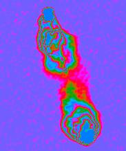
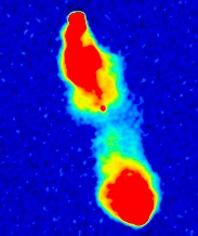
This is shown at right: the same image as before,
displayed with a linear pseudo-colour starting at the most negative image
brightness instead of at zero (which is what we did before).
True zero is rendered dark blue. The stippling due to noise is clearest
where the sky is really completely dark,
so that only the noise contributes to the image.
In the second place, because our measurements of brightness are not
perfectly
accurate, the brightness of the image at each point differs by a small amount
from the brightness of the (slightly blurred) sky.
Such measurement errors are technically called noise;
images with high noise are also said to have low sensitivity.
This inaccuracy has a noticeable effect when the true brightness is comparable
to the noise: you get a stippled pattern because some points are randomly
too bright and some too faint.
In fact, where the sky really has zero brightness (i.e. most of it, the sky
is dark!),
the image values are an equal mix of positive and negative
brightnesses. (Of course, the real brightness can never be negative; that
would correspond to energy being "sucked out" of the telescope).
This is shown at right: the same image as before,
displayed with a linear pseudo-colour starting at the most negative image
brightness instead of at zero (which is what we did before).
True zero is rendered dark blue. The stippling due to noise is clearest
where the sky is really completely dark,
so that only the noise contributes to the image.
There is an unfortunate connection between the level of noise and the resolution of an image: other things being equal, higher-resolution images tend to have relatively worse noise. Essentially this is because we have one "measurement" per beam-sized region on the sky. If we use a smaller beam, we are looking at a smaller region of sky for each measurement, and so we receive a smaller amount of power, hence the noise is relatively larger. In the Atlas, we have chosen images which strike a good balance between resolution and sensitivity; we also include a few "supplementary" images with high resolution but poor sensitivity.
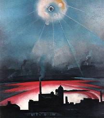 |
| Lens flare turns up, unexpectedly, in a painting: East River from the Shelton 2, Georgia O'Keefe, C 1926. |
We have tried to display the images so that the remaining artifacts are mostly too faint to see. Unfortunately it is not possible to do this perfectly, mainly because the visibility of the faintest levels depends on the specific VDU display being used.
The artifacts present in
radio images are quite unfamiliar because radio telescopes work on a
quite different principle from a camera
(aperture synthesis). Typically they
appear as "ripples" surrounding bright features, or as stripes. Some faint
stripy artifacts are just visible in our example radio image. When
several sets of stripy artifacts cross, the result is a noise-like
mottling of the image, except that the mottling is worse in the emitting
regions than in the surrounding "blank sky".
In ancient times, when astronomers started to list the positions of the stars, they faced the immediate problem that all the stars seem to rotate around the Earth once a day. One thing that seemed to remain fixed was the position of the celestial pole, near Polaris the Pole star, which is actually just the direction of the Earth's rotation axis. Because of this they gave the celestial pole a key role in the system of coordinates which we still use today. This system is similar to latitude and longitude on Earth. Declination, like latitude, is defined in terms of the angle between the star and the pole (actually it is the complement of that angle); traditionally it is measured in degrees, arcminutes and arcseconds. Right Ascension (RA), the equivalent of longitude, is bizarrely defined in units of time, with 24 hours around the celestial sphere. In one way this is quite practical: think of the sky as a huge clock which rotates around the Earth once per day: Right Ascension gives the time at which the object reaches its highest point in the sky. (A complication is that this is sidereal time, which gains one day per year against ordinary "solar" time). At the equator, one hour of RA corresponds to an angle of 360°/24 = 15°. A common source of confusion is that, as usual, there are sixty minutes per hour of RA, and therefore a minute of RA (written 1m) corresponds to an angle of 15 arcminutes (15'); the same goes for seconds of RA and arcseconds. A second source of confusion is that, again like lines of longitude, lines of RA bunch together at the poles, so that the angle on the sky corresponding to a given change in RA shrinks to zero as you go from equator to pole. Are you confused yet? It gets much worse.
Around 150 B.C., not long after astronomers started using the RA/Declination system, Hipparchus of Kos noticed that the celestial pole was not fixed on the sky at all, but slowly moved in a 25,800 year cycle around the ecliptic pole, which is the direction of the axis of the Earth's orbit around the Sun. This phenomenon is known as the precession of the equinox. Later on, other small wobbles in the pole position were discovered. The net effect is that the Right Ascension and Declination of every object in the sky changes slowly with time, in a very complicated way; and although the effects are "slow" to the human eye, the high resolution of modern telescopes means that the coordinates must be recalculated essentially every day.
To avoid this nightmare of ever-changing coordinates, positions are generally specified for a particular reference date, known as the equinox; usually astronomers use a round-number date such as 1900.0 or 1950.0, where the ".0" signifies the beginning of the year. To avoid the nominal coordinates going completely out of date, the standard equinox is updated from time to time; at the moment astronomers are converting from Besselian equinox 1950 (B1950.0) to Julian equinox 2000 (J2000.0). (Besselian and Julian refer to subtleties in the exact definition of the start of the year).
In 1973, when the number of radio sources was getting out of hand, the International Astronomical Union (IAU) recommended that each object should be "named" by its approximate coordinates in the B1950.0 system. At exactly the same time, the IAU was also busy preparing recommendations to replace B1950.0 with J2000.0. In 1985 they duly recommended that object names should be based on J2000.0 coordinates. Realising that this might cause some confusion, they also suggested that the prefix B or J be used to indicate the coordinate system was used. The exact reasons why the world's astronomers have officially adopted a naming system with guaranteed built-in obsolescence would probably make an interesting case study in sociology.
| <<<< | Atlas Index | >>>> | Alphanumeric List | Icon List | Jodrell Bank home page |
|---|